
How to Keep White Balance Consistent Across a Real Estate Listing
A listing should feel like one property, but every room has different light. Use reference frames and neutral anchors instead of one universal temperature.
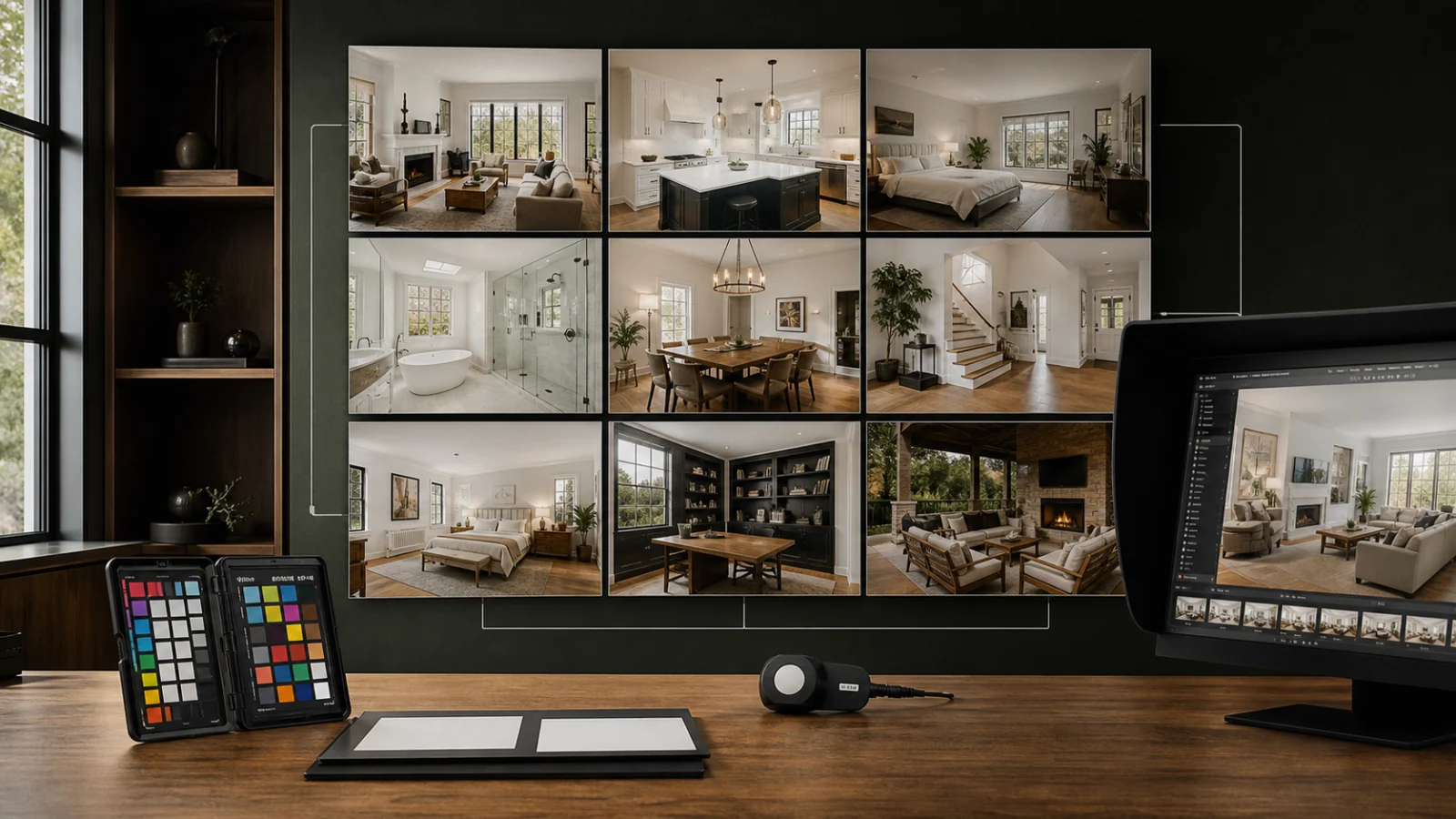
Consistent white balance does not mean applying one Kelvin value to every photo. Group images by lighting condition, choose a representative frame for each group, identify reliable neutral materials, and create a restrained baseline. Synchronize only the controls that should match, then correct each image for window light, fixture color, wall paint, and reflective surfaces. Review the listing as a contact sheet, because color jumps are easier to see between adjacent rooms than one image at a time. Preserve believable warmth from wood and lamps; do not turn every surface gray. The goal is for white trim, ceilings, cabinets, and shared materials to feel coherent while each room still reflects its actual light.
Why automatic white balance varies
A camera or AI tool sees different color distributions in every frame. A warm wood kitchen may push the result cool. Green foliage through a window can tint a white wall magenta after correction. A blue sofa can influence an otherwise neutral bedroom. Mixed LED bulbs may not match each other.
Auto white balance is a useful starting point, but independent decisions across 30 photos create a listing that flickers between yellow, blue, green, and magenta.
Group before correcting
Create groups such as:
- Daylight-dominant interiors.
- Mixed daylight and warm fixtures.
- Windowless rooms.
- Dark wood or strong colored-wall rooms.
- Day exteriors.
- Dusk and twilight exteriors.
Pick one reference frame per group with clear neutral surfaces and representative exposure. Correct that frame first. Do not use a white object in direct colored light as the only neutral anchor.
Find several neutral references
Useful anchors may include:
- White trim in indirect light.
- A ceiling away from bulbs and window spill.
- Gray stone, metal, or an appliance known to be neutral.
- Repeated cabinetry seen across rooms.
- A color target photographed under the scene light.
Compare multiple areas. If one “white” wall is painted cream, forcing it neutral will make everything else blue.
Synchronize selectively
Lightroom Classic can copy and synchronize develop settings across selected photos. Use that power carefully.
Settings that often transfer within a lighting group:
- Profile.
- Lens corrections.
- Base contrast and tone curve.
- Initial temperature and tint.
- Moderate saturation controls.
Settings that often need local review:
- Exposure.
- Window masks.
- Local color corrections.
- Highlight recovery.
- Crops and transform.
- Noise reduction and sharpening.
Synchronization should create a baseline, not skip inspection.
Handle mixed lighting
A global correction cannot make daylight, tungsten, and green LED sources all neutral at once. Choose the dominant visual story, then use local masks to reduce distracting casts.
Keep practical lights plausible. An illuminated warm lamp can remain warm while the adjacent white wall becomes less orange. Avoid sharp color boundaries around masks; light mixes gradually in real rooms.
If fixtures contain visibly different bulb colors, consider fixing them before capture. On-site consistency is faster and more natural than correcting every pool of light.
Review shared materials
The same white cabinet, floor, stone, or wall may appear in several angles. Place those frames together and compare:
- Neutral hue.
- Brightness.
- saturation.
- Wood warmth.
- Window color.
Shared materials are stronger anchors than unrelated white objects. They help prevent a kitchen from looking like two different renovations across angles.
Contact-sheet QC
Review thumbnails in expected listing order. Look for:
- A sudden blue or yellow room.
- Exteriors that do not match the interior time of day.
- Whites that become gray in darker rooms.
- Wood that changes from orange to green.
- Window views with inconsistent skies.
- One image with much higher saturation.
Then open flagged images at full resolution. Contact sheets reveal relationships; zoom reveals artifacts.
Use numbers as diagnostics, not targets
Temperature and tint values help track changes within the same camera profile and RAW workflow, but they are not universal color measurements. Two cameras can produce different-looking results at the same Kelvin value. A local mask can also make a wall appear neutral while the global value remains unchanged.
Use values to spot outliers, then judge repeated materials and reference frames visually. If one daylight room requires a radically different tint, inspect reflections, LED spill, profile selection, or a local mask before forcing it to match.
Keep exteriors connected to interiors
The exterior set frames the viewer’s expectation of time and weather. A cool overcast exterior followed by warm sun pouring through every interior window can feel disconnected. This does not mean the images need identical balance; it means the sequence should remain physically plausible.
Check that:
- Views through windows agree with exterior weather.
- Daylight color does not change abruptly between adjacent rooms.
- Twilight images remain a separate, intentionally graded group.
- Sky or window replacements do not introduce a new color source.
Make client preferences reproducible
When a client asks for warmer or cooler delivery, save an approved reference image rather than only a message. Identify which parts changed: neutral whites, wood, lamp warmth, overall tint, or contrast. Apply the preference to the next listing’s reference frames and review before updating a shared preset.
This prevents “warmer” from becoming progressively more orange across projects and gives editors a concrete approval target.
Export a small reference contact sheet in the same color profile used for delivery. It gives the next editor or revision round a stable target even when catalog settings, smart previews, or local profiles are unavailable.
Checklist
- ☐ Images are grouped by real lighting condition.
- ☐ Each group has an approved reference frame.
- ☐ Several neutral anchors support the correction.
- ☐ Repeated materials look coherent across angles.
- ☐ Natural lamp and wood warmth remain.
- ☐ Mixed-light casts are corrected locally and softly.
- ☐ Synchronized settings were reviewed per image.
- ☐ The full set is checked in listing order.
- ☐ Exports use one color profile and delivery specification.
The batch editing guide covers production grouping, and the before-and-after checklist adds final defect review.
Frequently asked questions
What Kelvin value should I use indoors?
There is no universal value. Camera profile, fixtures, daylight, paint, and capture format all matter. Use neutral evidence and reference frames.
Should ceilings always be pure white?
No. Ceilings can reflect wall color, wood, daylight, and fixtures. Make them believable rather than numerically identical.
Can presets keep white balance consistent?
Presets can establish a baseline, but temperature, tint, exposure, and local casts still need per-image review.
Why does a room look green after correction?
Window foliage, fluorescent or LED fixtures, and wall reflections may contribute. Check tint and use restrained local corrections.
Make the set feel like one property
Create a consistent baseline across a listing, then preserve each room’s real light through review. Try the real estate photo editor.